Understanding the mechanics of creating a simple template
This guide walks through a template setup exercise that creates a simple one column template that uses a top header; a main article with slideshow; and a footer. The directions below are designed as an exercise to create a specific template, but the instructions can be followed generically to create any type of template you wish.
Step 1: Adding Template Blocks (header, article, footer)
- From the Template Manager, click Create New Template.
- The template designer block should appear underneath.
- In the template designer block, enter a name in the Template name field. When naming templates, do not use spaces or special characters, aside from dashes, and ensure the name is unique.
- For the purposes of this exercise, use the name template-test.
- Click Add Block to add an element, such as header, footer, article, etc.
- For this exercise, click Add Block three times: we will add a block for the header, a block for the main article and a block for the footer. Each block will be configured with its own background color.
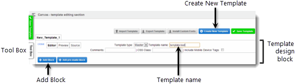
Adding components to the template is accomplished through the Tool Box which is available on the left side of the screen. Click Tool Box to display the tools. Click Hide to make it disappear.
Step 2: Setting Up Template Blocks
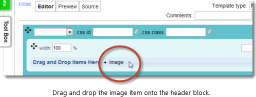
Header Image
Use the Tool Box to add an image to the Header section. In this exercise, we use a simple image container.
- From the Tool Box, expand the General section.
- Click and drag the image item from the Tool Box and drop it on the area labeled Drag and Drop Items Here.
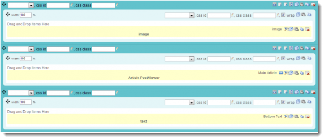
Main Article Slideshow
Repeat the procedure above to drag the Article Viewer component to the second block.
- From the Tool Box, expand the Article section.
- Click and drag the Article Viewer component and drop it on the area labeled Drag and Drop Items Here.
Bottom Footer
Repeat the procedure above to drag the Copy (Text) item to the third block.
- From the Tool Box, expand the General section.
- Click and drag the Copy (Text) component and drop it on the area labeled Drag and Drop Items Here.
Step 3: Naming Block Components
Naming components helps you to better recognize them and assign content when you create a page that uses the template. While naming components is not required, it does help you to remember what you're supposed to assign at the web page level when you configure the template.
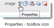
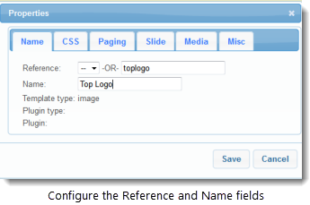
- Click the Properties tool (toolbox icon) at the bottom of the block.
- Click the Name tab in the component property window that opens.
- Configure the Reference and Name items by entering the suggested text presented in the table below. Please read the explanations below to understand how Reference and Name are used.
| Top Header Image | |
| Reference | toplogo |
| Name | Top Logo |
| Main Article | |
| Reference | mainarticle |
| Name | Main Article |
| Bottom Footer | |
| Reference | bottomtext |
| Name | Bottom Text |
Reference - acts as the unique ID for the component within the template. When you set up a web page, the system associates selected content to references. Try to maintain a high level of naming consistency among your templates so you can swap templates within a page without losing your page setup. For example, if you add a reference for an image-holding header block, make sure you use that same reference for all templates that have the same kind of component. Reference text can be letters and digits only - you cannot use spaces or special characters.
Name - use for display purposes only. The Name becomes the title of the component's' tab that you see when you set up a web page using the template. Names should be descriptive, but not too long. Typically, 2 or 3 words are sufficient. Avoid generic labeling, and strive to use names that describe the intent and purpose of the component. For example "Top Nav" and "Footer Text" are more descriptive and useful than "text1" and "text2."
Step 4: Styling the blocks
Styling the template requires you to provide additional information to each block, telling the web browser how it should be displayed.
LVSYS uses CSS (Cascading Style Sheets), which is a language that controls the styling of website elements. In a more advanced guide, we will provide some instruction on how CSS styles are created. For now, we will use some styles that follow LVSYS conventions, and are most likely already defined for your website.
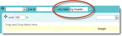
- Enter the style name in the css class field in the dark blue bar at the top of the block. Use the style names below for each template block.
- If you want to view the class style rules, click on the quick edit icon next to the class name. Be sure to click Cancel when finished so you close the style window without making any changes.
Header - bg-header
Main Article - bg-clear
Footer - bg-footer
If these styles are not defined on your website, do not worry. For the purposes of this exercise, it is more important to understand where styles are declared. Later in the exercise, when we pull the webpage, it will become obvious whether or not the styles exist on your website.
Step 5: Using code - setting up the main article with photo slideshow
Some components, such as images and text components, do not require coding, they can be used immediately, as is.
Other components, such as the Article Viewer, which is a plugin, do require some coding to be displayed, because an article is 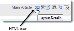 made of multiple items, such as title, body, photos, categories, etc. The presence of a small html button next to the settings button next to the properties icon indicates that a component can be styled. Note that there is no html button for the Text and Image blocks.
To code article layout elements:
- Click the HTML icon to open the Layout Editor.
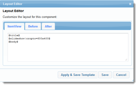
- In the empty ItemView tab, enter the following
@title@
@slideshow|cropto=600x400@
@body@
- @title@ will be replaced by the article's Title field.
- @slideshow|cropto=600x400@ will be replaced by a slideshow of the article's photos of the Article, and each photo will be cropped to 600 pixels wide by 400 pixels tall.
- @body@ will be replaced by the body of the article.
- Click Save to close the dialog box.
Finalizing the Template Setup 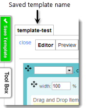
- Make sure you gave the template a name in the Template name field.
- Click Save Template (green button on the left side, above the Tool Box).
Allow some time for the template sections to refresh. At the top, your template title should display in a new rectangle. If you have followed this guide closely, you should see your title, template-test, display.
The next step is to configure a web page to use the template-test emplate.
Step 6: Configuring the Web Page & Testing
- Go to All Tasks > Web Site > Web Pages.
- Click Create New Web Page.
- Follow the setup for configuring a Standalone Web Page.
Do not enter Page Params - that step is unnecessary for this exercise. - Attach the template you created, template-test, in the Select Template tab.
- Use the page name template-test-page.
Once you have succesfully created your page, you should be able to see it by entering your website domain name, followed by a forward slash, and then the page name in a browser address bar.
Example: http://somedomain.com/template-test-page.
We encourage you to test and experiment with template options.